marketing
If what your company needs is a plan to communicate your message, sell your products or showcase your services, CerealStudio has over 30 years of experience helping the biggest brands achieve their objectives.
Below is an example of a marketing strategy from the ground up. Please scroll down to see each step of the process.
FC Boulder case study
FC Boulder, a youth soccer club in Boulder, CO. established in the 60’s and disintegrated in the 90’s, was reborn in 2012 from a merger of two local clubs. CerealStudio was trusted with branding the new club. So, the Logo was the first step.
Please continue to scroll down to see all the whole story.
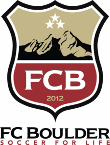
Logo Rational: The chosen shield and accompanying graphic accents represent the strength, depth, and stability of FC Boulder. The shape of the shield, with its distinctive central division, reflects the form of the Colorado State Shield. Boulder is best known for its mountains, particularly the Flatirons, which are a central element of the logo and convey a strong sense of place and community.
The color Gold was selected for its timeless association with excellence, achievement, and success. The Cardinal Red that forms the base of the shield symbolizes energy, strength, determination, and passion.
Finally, the stars positioned above the Flatirons serve as reminders for each of the Club’s players to hold themselves to the highest standards and to make a positive impact in three areas: for themselves, for their team, and for their Club.
After the logo was finalized, CerealStudio proceeded to create the basics; business cards, letterheads, etc…
One of the most exciting moments was designing the uniform that thousands of kids would wear on Saturdays.
Since then, CerealStudio created branding for all of their programs with the same DNA.
Print materials were then designed, like this pledge brochure..
And websites for their programs and tournaments.
CerealStudio then created a 20+ page comprehensive 2014/2015 marketing plan in which we identified 12 core values the Club wanted to promote.
Posters, magnets, and promotional gear were created for distribution to the membership. Each piece featured the Club’s core values, established through the marketing plan, as the foundation of the message.
CerealStudio also created 20′ x 6′ banners, 10′ flags and signs for the complex in which the Club plays their home games, thus giving it a Home Field feeling, giving the Club’s players and families a sense of belonging and pride.
A practical, easy-to-navigate umbrella website was developed, maintaining the same visual and conceptual identity as the rest of the brand materials.


